Salvaging the Smash MVP: 3 months with 0 room for error
ClientSmash.technology
YearSep 2023 – Jan 2024
RoleFounding Designer
TagsProduct Strategy · Design Systems · UX Research
Smash.technology is a place where students gain work experience and academic understanding to break into industry. The core product was our learning management system, a fully custom build from two dev teams, but a shrinking runway made budget and time overruns likely
The plan? Abandon it and hire specialists to customize an open-source alternative in three months. Result: Open edX ($20K) over the custom rebuild ($240K–$290K) saved us at least $220K and four to six months
$220kDev costs saved
SOW renegotiation and Open edX migration together. Feature set and data privacy compliance increased by building on stable ground
+43NPS at launch
From a beta NPS of −17 to a general-availability NPS of +43, a 60-point swing in six weeks post-launch
3 moMVP delivered
Shipped on time and on budget. The remaining two months of the contract went to testing and iteration
The problem
Three things were true: the product had real ambition and a thoughtful pedagogy underneath; the offshore team, capable but under-briefed, had been shipping for months without guidance or feedback before I was hired; users were coming in with questions but leaving even more confused than before
Smash intended to systematize what a passionate UW professor had been doing by hand for years: helping bright but unconnected students get the work experience and preparation to land their first jobs in industry. But the system was trying to be a learning tool and a hiring pipeline simultaneously without bringing clarity to either
"I'm not sure what to do here. There aren't any real interviewers. Do I have to learn something to get a real interview?"
That quote, from a first-time user navigating the platform alone, was the clearest diagnosis that the product wasn't legible
Constraints
These shaped every decision I made
No internal engineering team; all development outsourced to an offshore shop under a waterfall contract. Being remote and distant, I couldn't walk over to an engineer's desk
Budget fixed and shrinking. Every week of delay cost real money against a finite runway
No existing design system, no design-debt documentation, no component inventory. Starting from zero artifacts
Active users already in live cohorts. I couldn't throw everything out and start over; migration and continuity mattered
Research and discovery
Before touching a wireframe, I spent the first two weeks in discovery, understanding what was actually broken from the user's perspective, not the roadmap's
Stakeholder interviews with the CEO and team leads to map the gap between what was promised to partners and users vs. what the product actually could do
User interviews with five to eight active students, focused on their mental models: what did they think Smash was for, and where did it fall short?
Heuristic evaluation of the existing product: every flow documented for context-switching failures, information architecture inconsistency, and misleading UI
Competitive audit of eleven comparable platforms across three axes: learning and upskilling, real-world projects, and hiring enablement
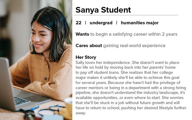
The research produced a clear primary persona: a student who understood she needed career help but had no idea how to navigate the industry landscape or what platforms like this were even for
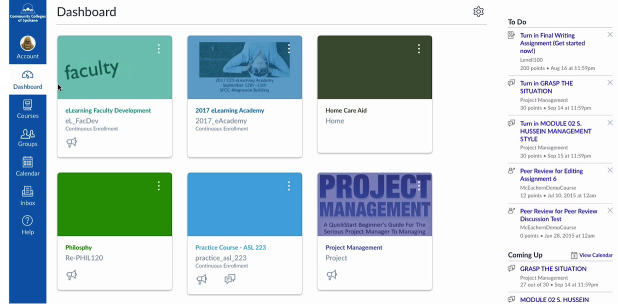
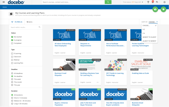
Part of discovery was understanding what students were used to seeing in LMS platforms, what "normal" looked like before they arrived at Smash. Canvas and Docebo set the baseline
Canvas
Docebo
The competitive audit revealed a genuine opening: no competitor was doing all three of meaningful learning, real industry projects, and direct hiring pipelines in a single integrated platform. That framing became the foundation for every scope decision, which afforded clear directions for prioritization, too
The strategy
Success required more than new screens. It required a structural overhaul of how the product was built, starting with the contract. I spent the first two months functioning as a technical product manager as much as a designer. The design problems were downstream of process problems, and nobody else was positioned to fix them
One pivot defined the turnaround. The ambitious custom redesign was going to take nine months minimum and $240K to $290K, and climbing: not viable for where Smash was at that time. I rejected the premise and got creative. Why hadn't we considered open source? I settled on Open edX and found a team that specialized in custom Open edX work for educators. They shipped in three months for $20K, on time and on budget, with two more months for refinements
The tradeoff was real: walking away from the in-progress custom build and designing within Open edX's constraints, to ship in three months for $20K instead of nine-plus months and a quarter-million dollars. I don't consider the first redesign wasted because it built the design system and proved the direction, even if it ultimately couldn't deliver. Choosing Open edX over the custom rebuild fixed several profound problems while better delivering on our goals
What I killed
At a startup with a fixed runway, every yes is a no to something else. Some of the most important design work I did at Smash was deciding what not to build
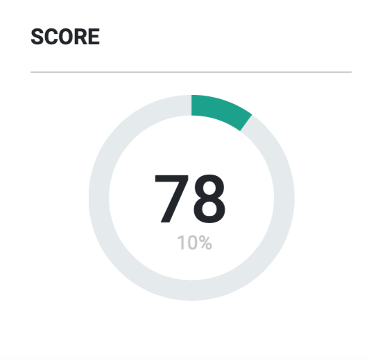
The Smash Score. A personalized metric comparing a student's skills against hiring requirements, controlling access to projects and introductions. User research did it in, because students didn't trust it ("What happens if it's wrong?") and a mysterious score determining their futures felt fundamentally unfair. I removed it entirely and replaced access eligibility with explicit, transparent criteria
Native chat. Too technically unstable to ship reliably. Cut it and pivoted to Microsoft Teams as a communication layer, as students already had access to it, rather than re-inventing the wheel
Interviews and mentors. Both planned, both deferred explicitly. We couldn't deliver them at a quality level that matched what they promised. Shipping a half-built mentorship feature would have damaged credibility more than not shipping it at all
The pattern across all three: I wasn't cutting because they were bad ideas. I was cutting because shipping a focused, trustworthy product was worth more than shipping an ambitious, unreliable one
The events redesign
The events discovery flow is where the design evolution is most visible. It went through three distinct states across two years
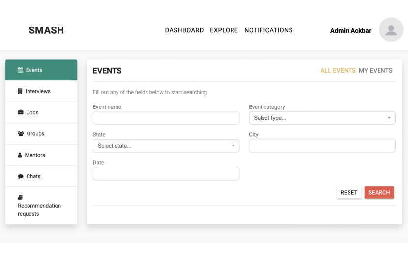
The original. The inherited events page required students to fill out a search form (event name, category, state, city, date) before seeing any results. "Fill out any of the fields below to start searching." One student described it exactly: "I only see what I search for, but how do I see everything to know what to search?" It was a search-first paradigm applied to a browsing problem. Students didn't know what kinds of events existed, so they didn't know what to search for, so they found nothing and gave up
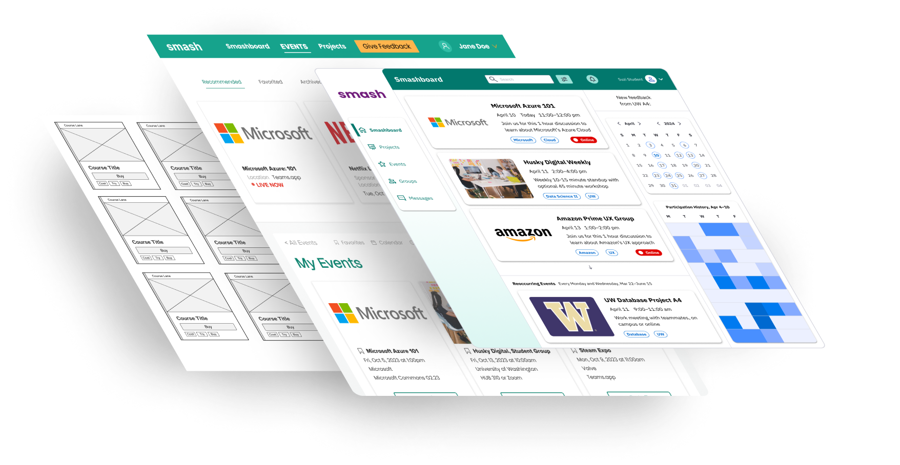
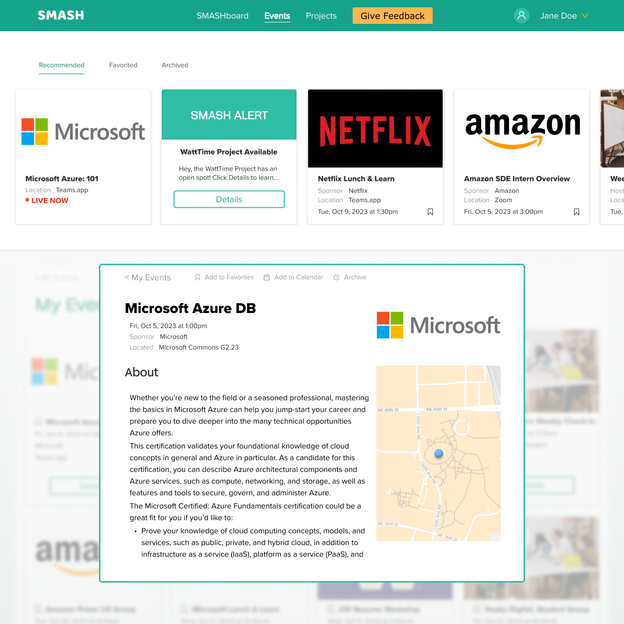
The first redesign. I replaced the form with a card grid: all available, eligible events displayed upfront, browsable without any prior search input. Clicking a card opens a popup overlay with event details and the registration action, without navigating away from the grid. The background blurs behind the open card, signaling that clicking outside will dismiss it. This interaction pattern was established here and carried forward into the final product
The Open edX build. The platform migration brought component and layout constraints that required adapting the first redesign's visual direction. The core interaction logic (card grid, popup detail, dismiss by clicking outside) remained. The aesthetic changed to reflect both the Open edX framework and the expectations of the corporate partnerships we were building toward. It shipped in twelve weeks, on time and on budget
The rest of the canvas
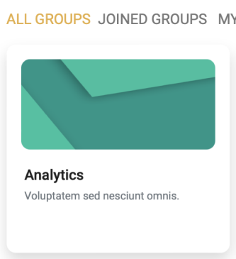
The events flow tells the clearest story, but the redesign touched more than one surface. The groups card and admin panel each went through the same before/after arc, from inherited build to Open edX build
Before: original groups card
After: Open edX groups card
Before: first redesign admin panel
After: Open edX build
How it shipped
We shipped the MVP in twelve weeks, on time and on budget. The following eight weeks were tests and iterations: product demos and working with a limited set of students to pressure-test what we'd built
Six weeks after GA, NPS was +43 against an internal target of +20, up from a beta score of −17. The legibility problem was gone: students could finally tell what the product was, and what to do in it
"I really like that I only see what works and that it's clear now."
What I'd do differently
The Open edX pivot should have happened sooner. The savings were so significant that an earlier move could have materially changed the company's trajectory. The first redesign proved the design direction, but it could have been applied to the right platform from the start. This was a cause of accepting the premise I was given instead of questioning whether our direction was even correct
Design-wise, I would have prioritized hierarchy for how cards were presented on screen more. For instance, the amount of colors on a page full of cards meant they all competed with each other rather than encoding useful information to users. Adding to the cognitive load was the requirement to scan across two dimensions, rather than one. The concept was based on shopping, but now I would test against that, especially as searching for events is more about quality than quantity
I'd start usability sessions in week one, not month two. The screens I redesigned in weeks one to three were the ones I redesigned again in weeks eight to ten. We had users from day one, so this would have been trivial