The Smash Design System: Iterations
Smash is a learning and hiring platform for students. I was given an existing but undocumented product with the task to reimagine it. I built a design system in Figma that was atomic and initialized by Ant Design: primitives became variants, then components, up to full screens. Then... we migrated to Open edX. This is that story of what we built, what we abandoned, and what survived
104
Components
An atomic library: primitives composed into variants, then components, up to full screens
22
Product pages
Every screen built from the system, no one-off styles
1
Variable to reskin
Changing the root token propagated across every button, badge, and nav item
Token architecture
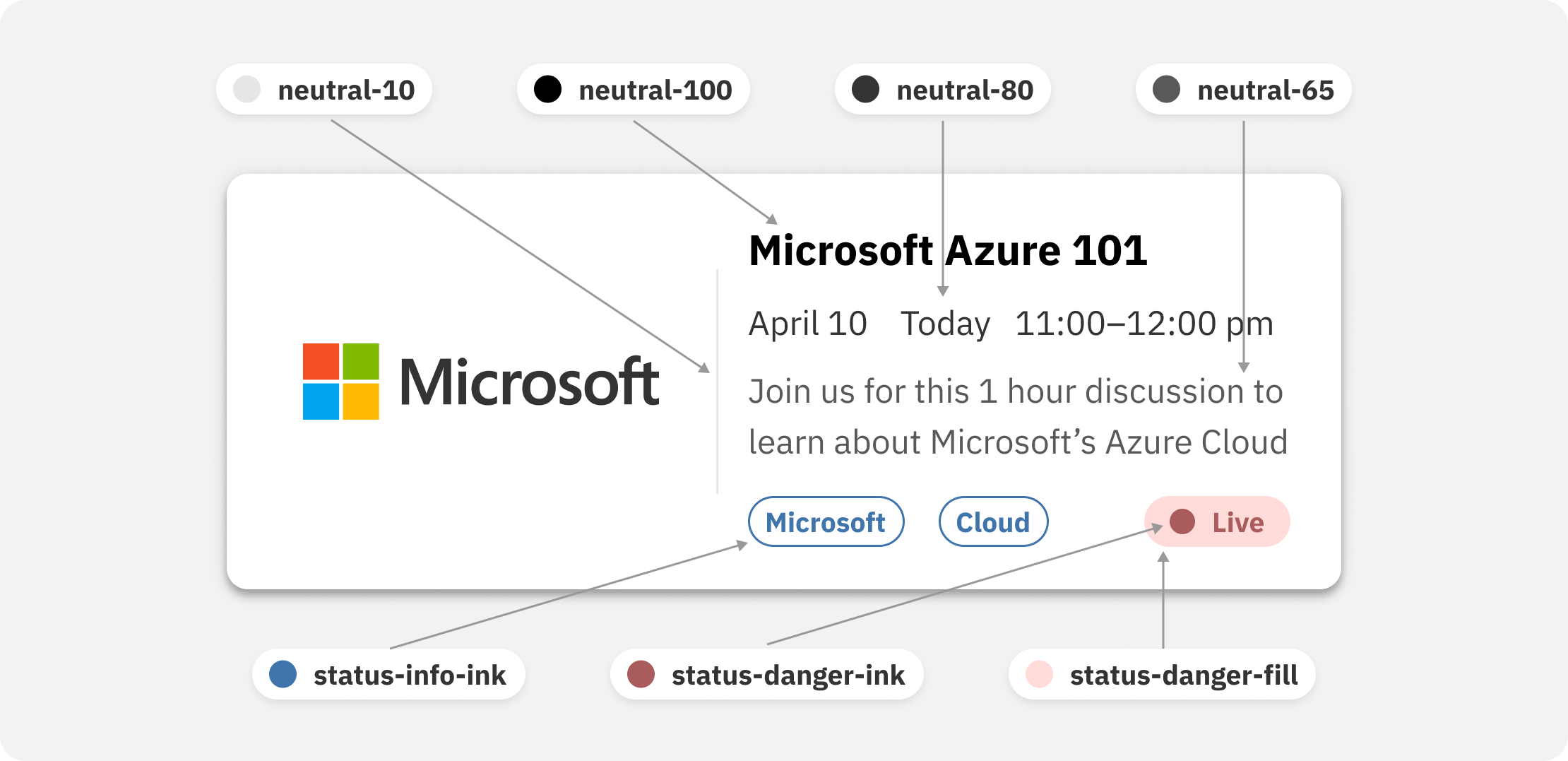
I started with one raw hex value derived from the original product: #16A38C. This teal primary color set the scale for everything (primary-100)
The practical effect was one of leverage: changing the root variable pushed that change to every button, badge, and nav item across the product. This is the type of leverage I'm always looking for, and it's what allowed an, at times, one person team to keep up with the demands of designing a multi-screen product in a dynamic environment
#16A38C
→
primary-100Top navActive tabJoin buttonJoined pill
#000000
→
neutral-100Card title
#595959
→
neutral-65Date and timeAttendee count
#E6E6E6
→
neutral-10Card border
#FFFFFF
→
neutral-0Card surface
#F2F2F2
→
neutral-5Page background
Edit one token: every consumer downstream re-skins
Color
Color in the system was deliberately narrow: one hue plus neutrals (neutral-0 as white to neutral-100 as black), with a couple accents based off that teal primary in my first version. On the second version, these accents were abandoned and we only relied on status indicator colors and colors derived from partner brands
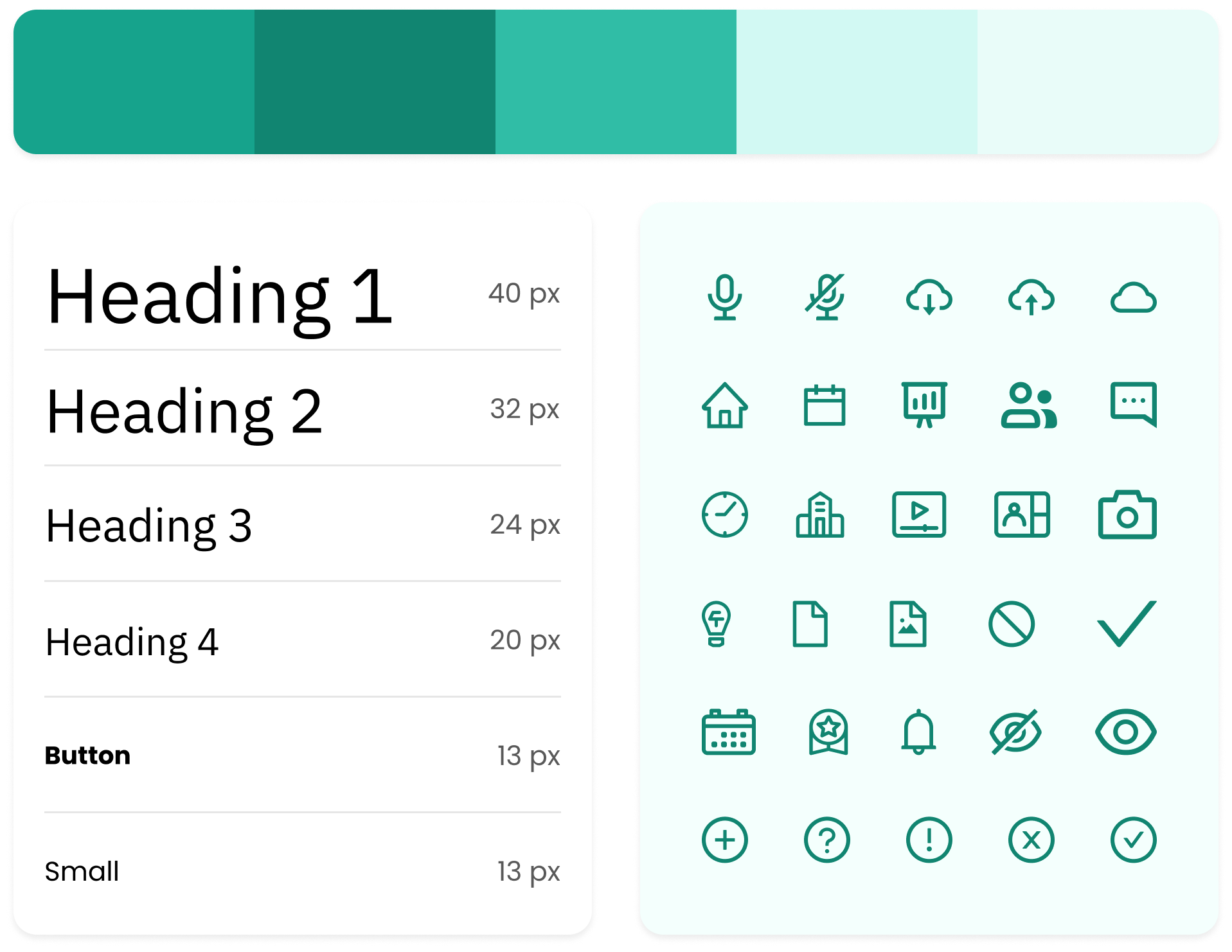
Typography
The type system was built on Tahoma for the technical reason that it ships preinstalled on virtually every computer a student might use, but as we went along we decided we could safely move to IBM-Plex Sans. In the end, we landed on 6 named sizes from display to button to caption
Components
The event card was an important component for the product, because events were the catch-all between students, work studies, hiring managers, and learning opportunities or even sponsorships. These needed to carry company branding, dates, tags, and a status indicator for live events without becoming cluttered
The detail view allowed users, on click, to view a pop up instead of navigating to a new page and losing their place while allowing for easy comparison between events. The event list was visible in the background, with some iterations showing a light blur effect behind the modal to accentuate the detail view and suggest that clicking outside the boundaries would dismiss the card, but this didn't survive the Open edX version
The pivot
In summer 2023, I successfully petitioned to move the product onto the open-source Open edX platform
The custom implementation we were working on would have required sustained engineering investment to build to spec. Open edX gave us a production-ready LMS backbone, data privacy and accessibility compliance out of the box, and a timeline that fit the runway. This wasn't an easy choice, but it was the right one to do
What survived
Moving to Open edX meant inheriting its backbone: the data model, the page semantics, and a different tech stack. Practically all I carried across was the design system itself: the teal primary, the token architecture, the card-based hierarchy, the tag and status system, and the interactions and features we'd earned from user research and experience
I reapplied the design system on top of this new backbone, reworking the presentation in HTML and CSS as best we could. This was the opportunity for a fresh start: with more experience and skill, the reskin came out sharper than my prior version. The design system didn't just survive the migration, it improved from it. This led to greater credibility with users and perhaps even product demos for landing contracts and partnerships
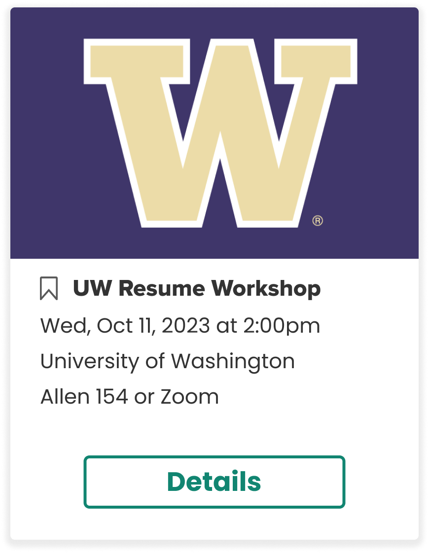
2023 · Custom buildBanner logo, CTA, location heavy
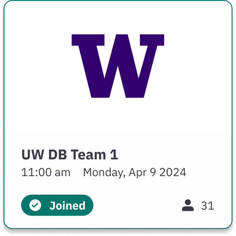
2024 · Open edX reskinTop accent, status pill, attendee count, tighter hierarchy